Documenting UI Components with Storybook
As a frontend developer, I find it difficult to document components in my apps. Not only for other team members, I sometimes forgot what the component looks like, what data it expect to be passed on, what functionallity it has, etc.
All this time, I never bothered thinking about how I can remember all of my component specifications, let alone providing a clear definition for my team. Then I realized, this sort of thing could be problematic and could cause confusion in the future. At this point, I started to think about how I can document my UI Components in a fun way.
After doing some research, I found a really fascinating tool that focuses on documenting UI Components. Let me introduce you to Storybook!
Storybook is an open source tool for building UI components and pages in isolation. It streamlines UI development, testing, and documentation. It allows developers to create organized UI systems making both the building process and documentation more efficient and easier to use.
Without waiting or doing more thorough research, I immediately propose using tool during our development and explain the benefits of using it. Then my idea was very welcomed by my team and I felt so excited and fired up on implementing it.
So, what does Storybook give you? Well, here's several things that I get from this tool:
1. UI Component Listing
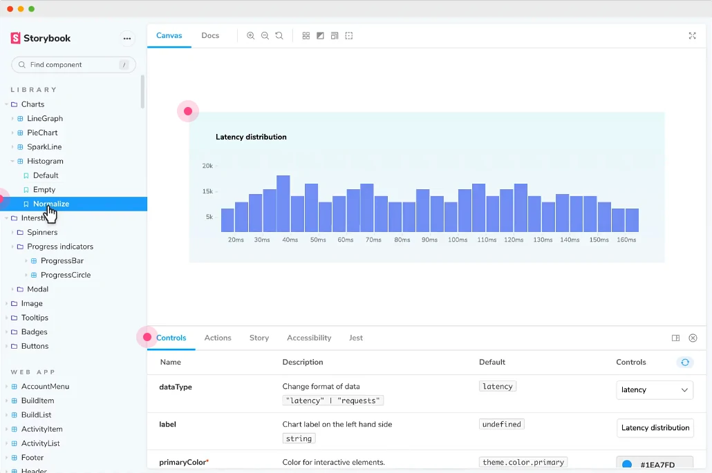
My main focus at that time was to have a way to list out all UI Components we have in our application. Storybook has this thing called "story". A story is a place where we can show a particular component in an isolated environment. Simply saying, we can import our component and put it in a story file. The story will show the component depending on how you "tell your story". You may have a story where it only displays component as it is, or you can give a detailed use case implementation such as component variants, responsive behavior, or anything you have in your components. The other nice thing I like is, we can make a folder like structure in our story list which make us easier to organize the component list.
2. Documentation
One the nicest thing of Storybook is it provides us an awesome way to write down documentation. We can put any properties that our components have and list them all in our story with custom control. This custom control really is amazing, we can customize what kind of data type the prop expect. Let's say, your component has a prop called 'name' with data type of 'string'. We can define this prop in our story. Then in the Storybook page, we can see that this component has 'name' prop which expect 'string' data type. Then we can change the value of the prop on the fly. Imagine you have so many props, whether required or non-required. You might forgot all the props in the future, but if we write the documentation for it in storybook, you won't have any problems remembering all of them since all you have to do is to look at the documentation in your story.
3. Visual Testing
When building a UI Component, our main focus will be how the component looks like. When working with design system, we certainly want to make sure the components we are building match with the design. Storybook gives us tools to help us with this. It has measuring tools that allows us to measure the size of the component, padding, margin, etc.
4. Functional / Unit Testing
Apart from visual, you might also want to test the functionalities of your components. Let's say you want to test if your button will do something when you click it. You can add action to your story and mock the functionality. This will ensure that your component will behave like you want.
5. Integrate with Design File
Sometimes, it is just really handy to see your component and compare it to the design side by side. Good thing is, Storybook has a plugin that allows us to embed part of your design file into Storybook stories.
Those are certainly only a few of benefits you get from Storybook. There are more features you can get apart from what I have listed above. So, try Storybook on your frontend app next time and explore more features and share what you find!